
Can 3 point text be readable?
Fancy feats with an infinitesimal font

This post is all about TermDriver, a USB/serial adapter that is shortly launching on Crowd Supply. Please consider subscribing there if you’re interested. Thanks.

TermDriver is a USB to serial adapter with a tiny screen that shows the serial character traffic. To be specific, “tiny” means 24x24 mm. So displaying 24 lines of text means each line is 1mm high. That’s a 3 point font. For reference 6 points is normally considered the absolute minimum for readable body text.
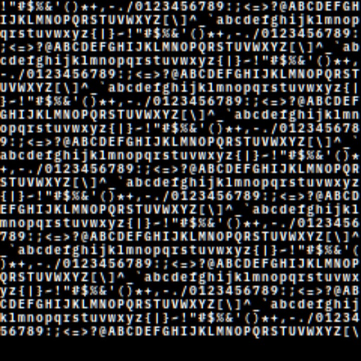
The screen itself is really excellent. The resolution is 240x240 pixels, so the pitch is 10mm/pixel. After some experimenting, I found that 40 column text was just about readable, which gives a character cell size of 6x9 pixels. This includes spacing between characters, so each actual character has a width of 5 pixels.
Here’s how that looks on the display. The font is IBM Plex Mono, used for all Excamera Labs products. It’s OK, but there’s plenty of room for improvement.
When I said that the display is 240x240 pixels, that is true. A pixel is a square. But on LCD displays a pixel is really three vertical emitter elements, for red, green and blue.
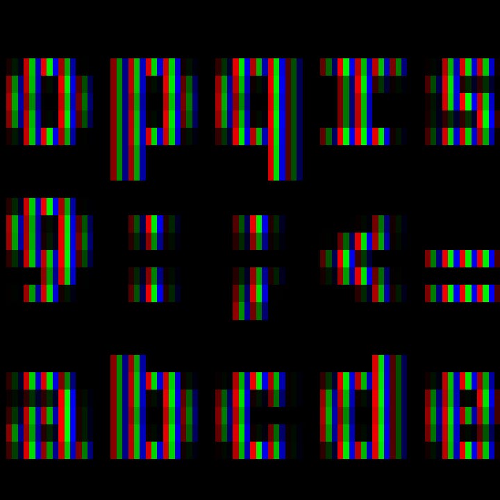
For white text like this, each RGB triple has the same brightness for all three emitters. Subpixel rendering is an long-used technique for increasing text resolution. All you do is consider each emitter element as a pixel. So this would effectively increase the screen resolution from 240x240 to 720x240. It gets you a lot more horizontal resolution, apparently for free. There must be a catch, right? There is, and I’ll talk about it later.
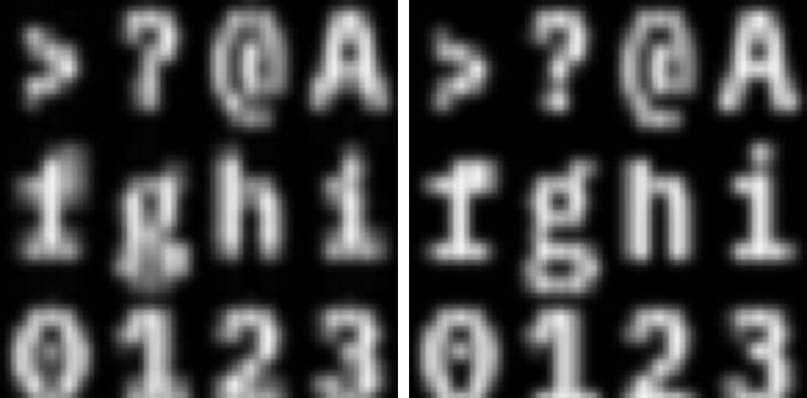
So instead of generating character cells that are 6x9 pixels, in this scheme they need to be 18x9. My initial approach was to generate a 18x27 glyph for each character, then squeeze them vertically to make 18x9 glyphs. Simple enough. This is the result. Original pure cells on the left, attempt at subpixel rendering on the right.
Needless to say, it looks a lot worse on the right. The lowercase ‘g’ has collapsed at the bottom. The dot in ‘?’ has joined up with the body. What’s going on?
The answer is font hinting. TrueType and OpenType fonts contain hints so that geometric features of the glyphs line up with pixel boundaries. Somewhere in the font is a hint that specifies that ‘?’ has a gap between the body and the dot. Resizing a larger font to a smaller size loses this information, so all the nice crisp boundaries are lost.
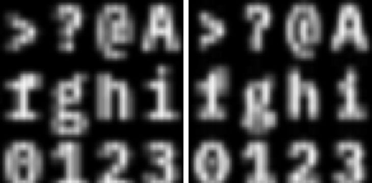
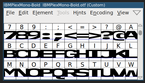
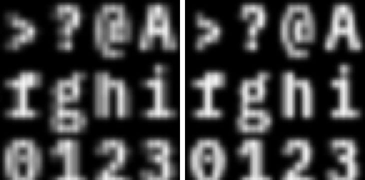
Fortunately Linux’s fontforge can quite easily scale the font itself, giving a font that is the size that’s needed without losing the hinting information. It looks a bit weird in the preview, because the width has been tripled.
Using this new stretched font, there’s no scaling required. These triple-wide glyphs naturally fit in a 18x9 cell. Here’s the comparison. Glyph stretching on the left, font stretching on the right.
The hints have been preserved. And for a final comparison, here’s the original whole-pixel display on the left, subpixel rendering on the right.
The catch I mentioned earlier is this. In graphics, Dr Nyquist is always waiting to come out and bite you. If the frequency of the signal (here, that’s the text) is higher than half the sampler (here, that’s the pixels) then there will be be aliasing. Intuitively, if a block of color spans three emitter elements, then you’ll get equal values of RGB and the impression of white text. However if it spans two columns, then you’ll get a magenta, yellow or cyan fringe. This is why some people dislike the look of systems like ClearType - it can produce color fringes.
You can see those fringes most clearly in characters that have fine detail, like the ‘@’ sign. ‘W’ also shows some fringing because its narrow verticals don’t cover three adjacent emitter elements.
But the slight color fringing is a small trade-off against much better readability. On the actual screen, the letters do look crisp and clear, even if they are only 1mm high.
And that’s how TermDriver’s text rendering is optimized for readability. TermDriver is launching on Crowd Supply soon. Please sign up on that page for updates if you’re interested.
Thanks for reading.
I’ll be at Teardown in Portland this weekend, and will have some TermDriver samples so you can see for yourself. I’ll also be giving a talk on algorithmically generating PCB layouts from scratch: “Making your own Gerbers.” Say hi if you’re there.
"so the pitch is 10mm/pixel"
should that not be 10 pixels/mm
?
The RGB fringing can be eliminated with math. Microsoft has long held a patent on the process but I believe it is expired now. The technique is called "box filter RGB decimation process".